Starting Out 2: Downloading and Importing Event Data
Now we get to the ultimate goal of this tool: getting access to all the data that anyone from any team has provided, in a format that's useful for analysis!
Obviously you can look quickly at the tables of data for each of your events on the My Events page. But as humans, we're very visually-oriented and tables of data aren't the most useful way of finding insight.
So the first step for creating visuals to see what the data says, is to download the data. On the Event page you can click the "Download CSV" button and save the file somewhere you can access it (your desktop, for example).
Option 1: Excel or Google Charts
It's pretty easy to make charts in spreadsheets. They're not the most insightful, but it can help you get a big picture of the data.
Chart style 1: Single Team data
Start by opening or importing the .csv into your spreadsheet application.
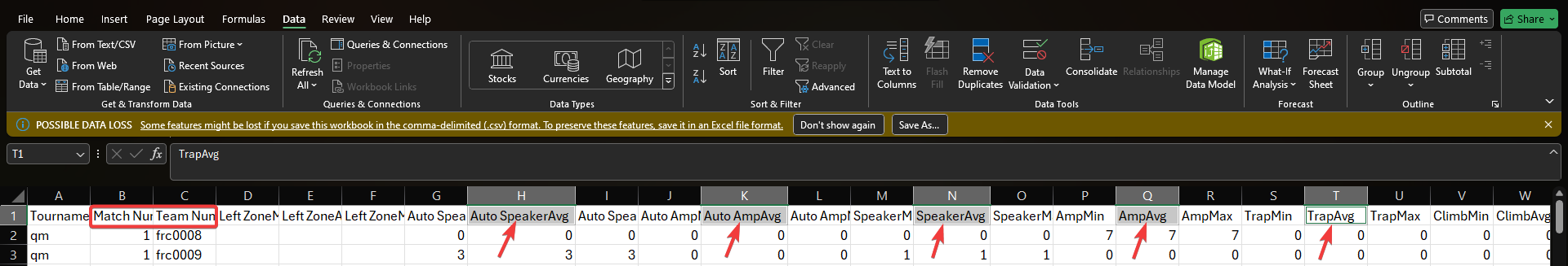
We provide a LOT of data in the CSV exports; since we might have multiple people providing information for the same bot in the same match, we take all of the data and for most of the numerical items, we provide a "Min" column (the lowest number anyone provided for this bot in this match), a "Max" column (the highest number anyone provided for this bot in this match), and an "Average" column. If everyone scouted perfectly these three sets of columns will all match. But we know there will be different numbers from different people so we're letting you choose what you want to analyze.
So decide what you want to graph. In this example, we've decided to graph the AVERAGE number of two autonomous scores and three teleop scores. We'll also need to include the match number (for the horizontal axis) and the team number (for filtering).
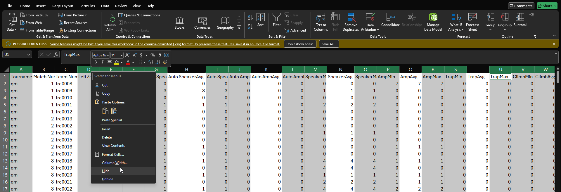
This step is optional but useful; we recommend hiding the columns you won't need. Hold CTRL or Command while clicking on the headers of the columns you don't need. Then right-click one of the headers and choose "hide".
That's much more manageable! Now we need to turn on filtering. On the
Datatab, click the Filter button so that the column headings become filters.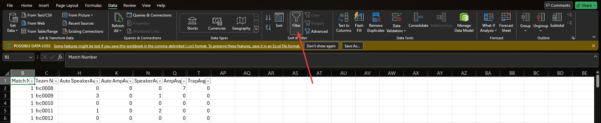
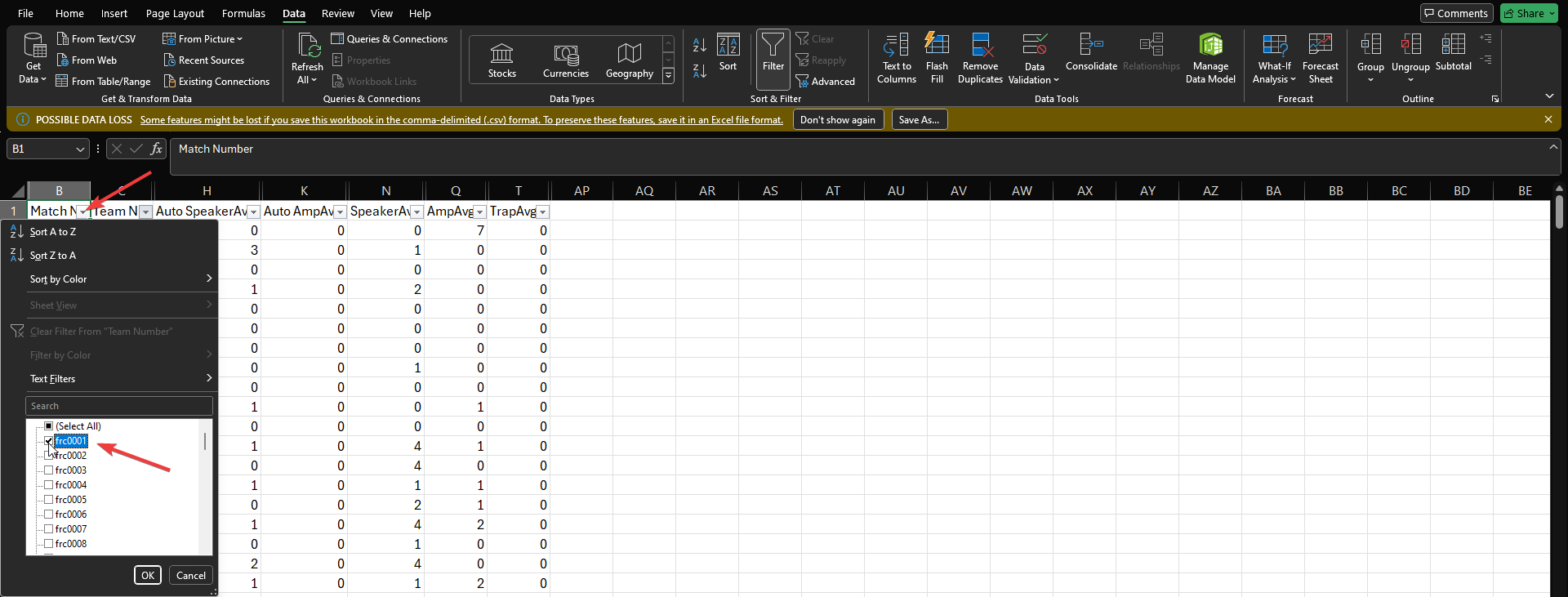
Great. Now filter for one of the teams to limit the rows shown. (Doing this first ensures the chart we'll add next will stay visible - otherwise sometimes it gets hidden when we choose different teams).
Now we're ready to insert the chart! Hold Ctrl or Command again while you click on the column headings to graph. Make sure to include the match number first (the first column becomes your horizontal axis). Once they're highlighted, click on the
Inserttab, and then click the "Scatter" chart type and choose the style you prefer.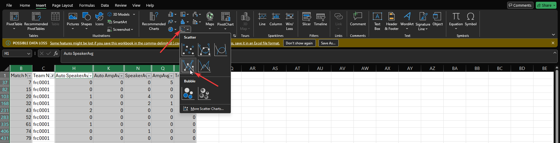
Really close now!
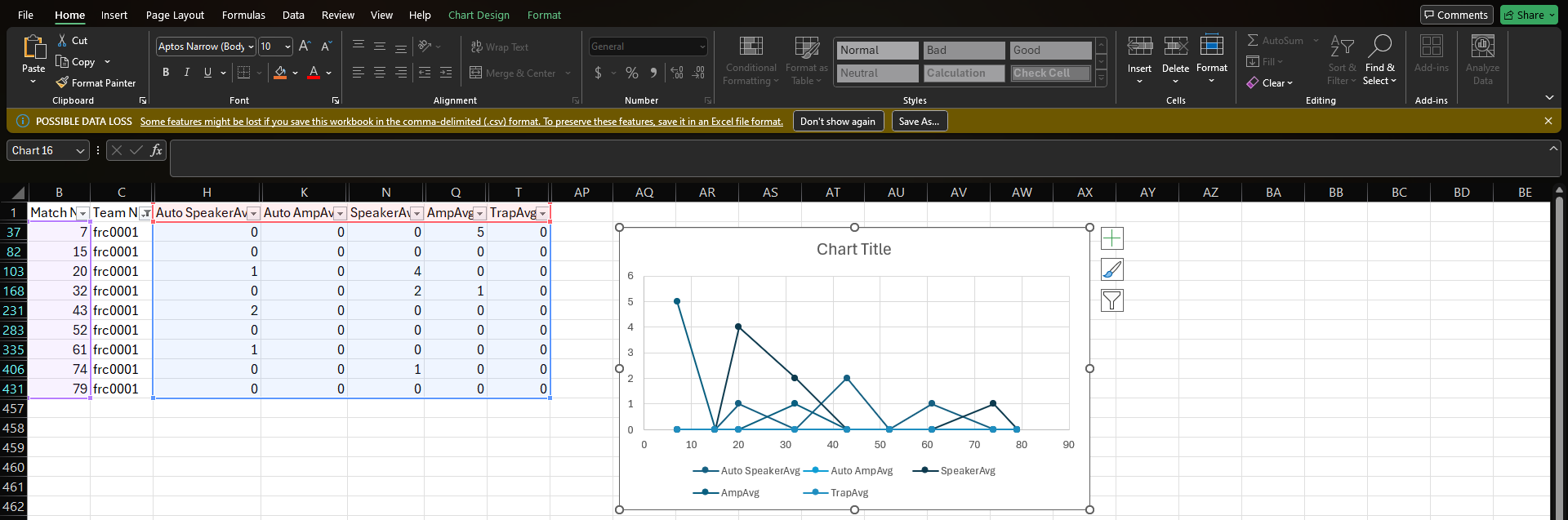
We recommend giving the chart a title, and updating the
OutlineandFillof each of the series in your key; this makes it easier to tell what's happening. For example, here we made the autonomous data use a dashed line and changed the colors for clarity.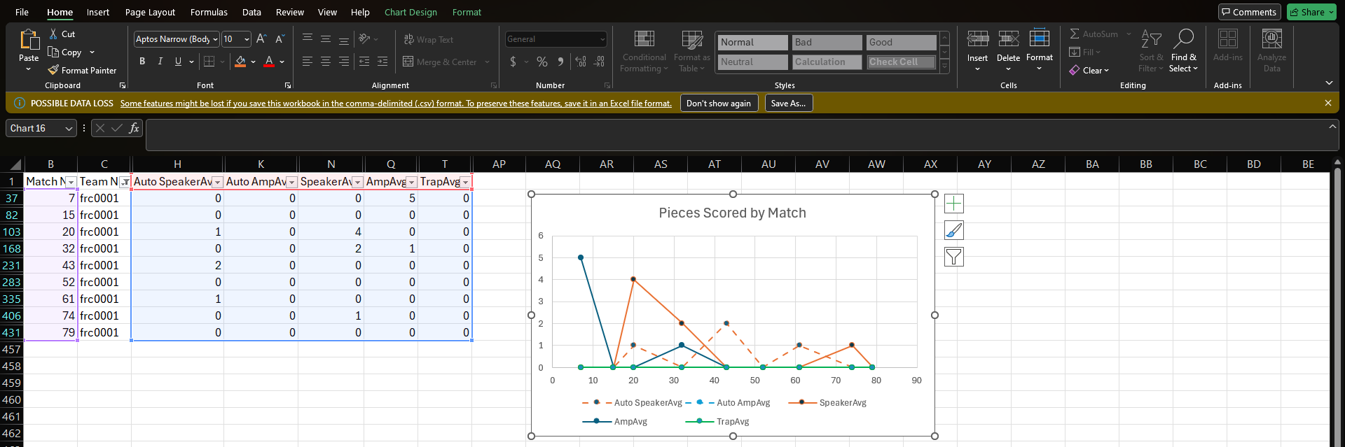
That's it! Now you can use the filter on the Team Number column to change which team is being graphed.
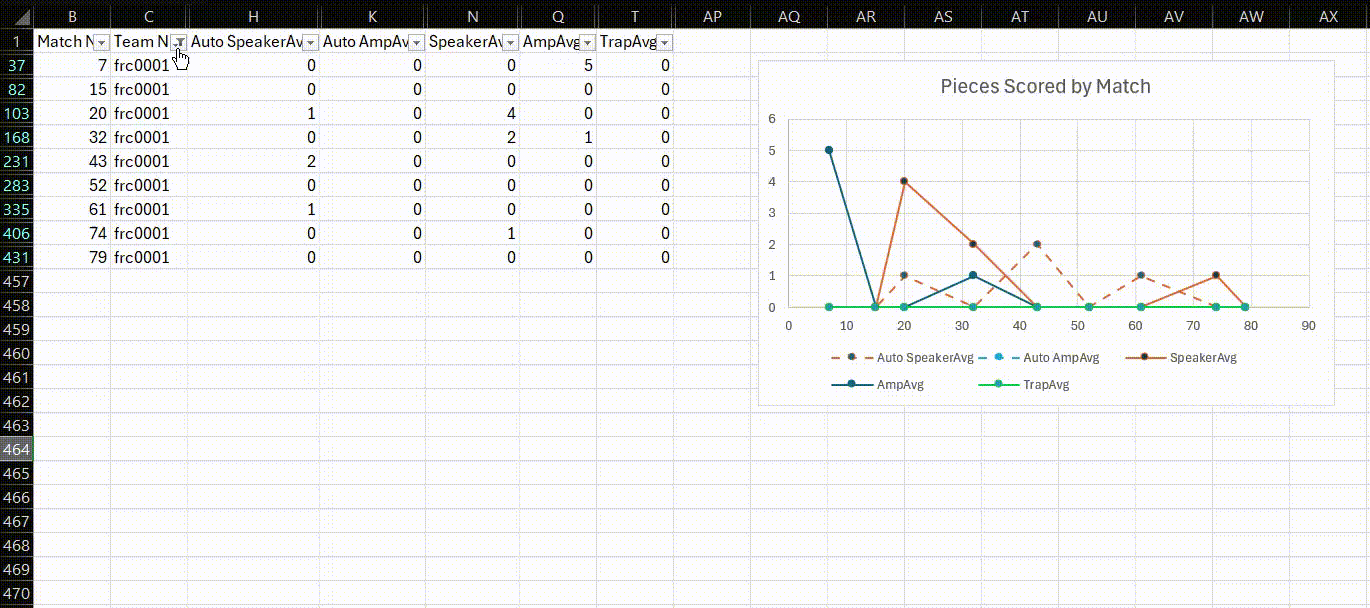
This is a basic example, but you can add multiple charts to the same spreadsheet if you'd like or use these basics to create some new columns in the data that you chart instead. Hopefully you're starting to see the power of what you can do!
One more thing: like the warning says, if you just save this file, it's only saving the .csv which is only plain text. Your charts will disappear if you close this file and then open it up later. So you need to save the file as a spreadsheet (.xlsx) instead of a .csv if you want to save your charts in the file.Chart Style 2: Excel Pivot Chart
We'll start this chart from the same filtered set of columns, but this time we won't need the Match Number column; we'll be looking at the total numbers of different types of points scored by each team, all together, rather than on a timeline.
So if you were following along above, don't worry about the filtering. Choose to show all teams, or alternatively turn off filtering completely. Then hold Ctrl or Command while you click on each of the column headings as shown. Then on the
Insertmenu, click on "Pivot Chart".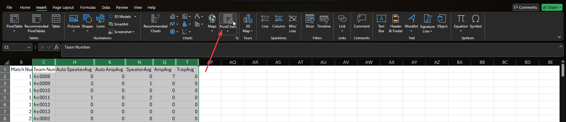
It will ask you a few questions- the data selection will already be done thanks to your highlighting, so just choose to add the pivot table to a new sheet in the workbook.
Now you'll need to tell it how to build the pivot table. Drag
Team Numberdown into the axis selector, and then drag each of your data columns to make your list of data. Each of these will show up in the table as their own columns, in the row of the team they're associated with.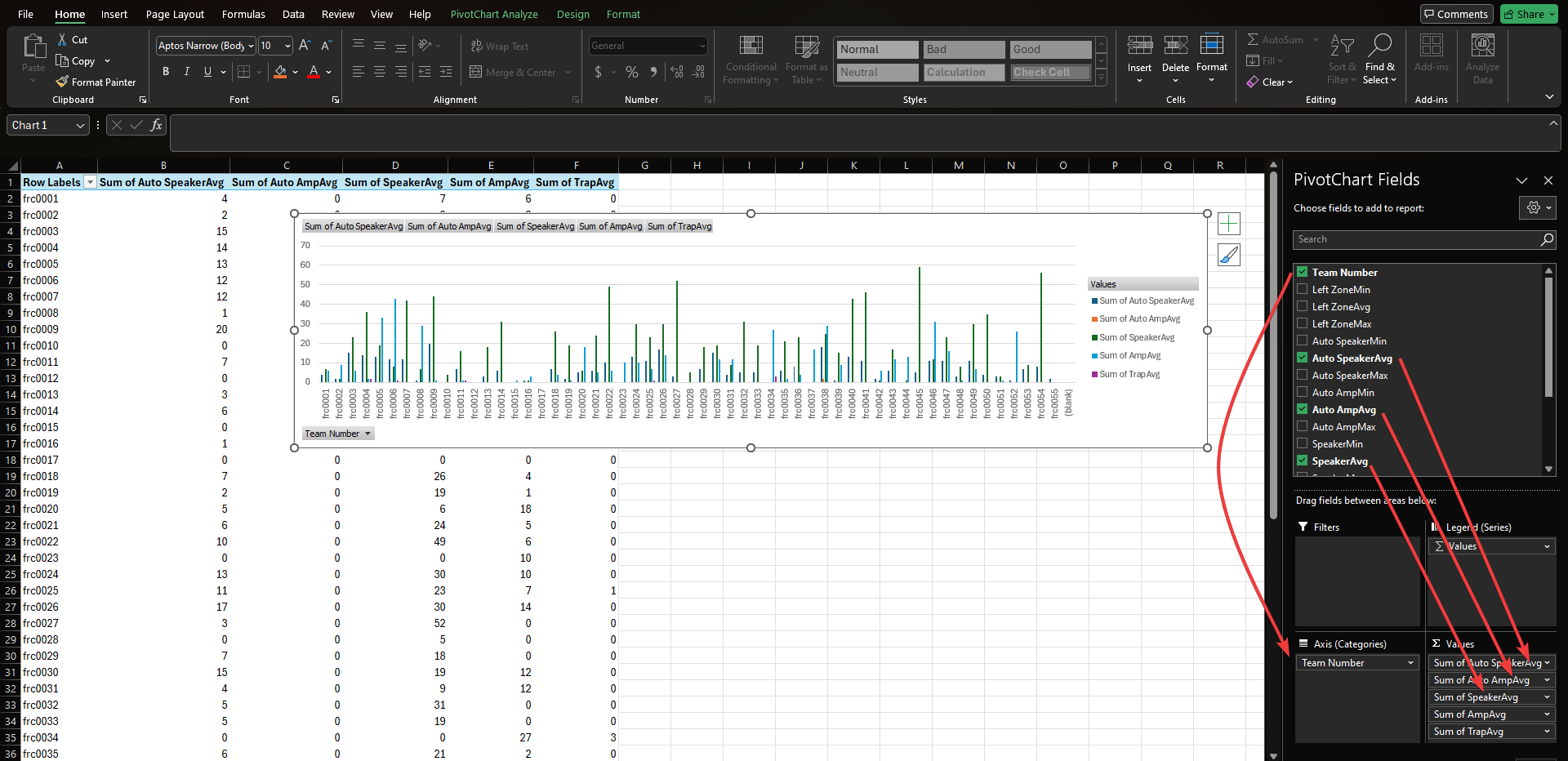
By default, it will be using bar charts, with separate bars for each of the data points, grouped by the team. This is great if you only have a few teams selected (note you can choose which teams to show using the drop-down in the bottom left of the chart), but if you're looking at the whole lineup of teams, the bars are simply too small to be useful in this format.
For this number of teams, you'll probably want to change to a
Stacked Column Chartinstead, so each team only has a single bar, with multiple colors stacked up and showing you a total. So right-click on the chart and choose "Change Chart".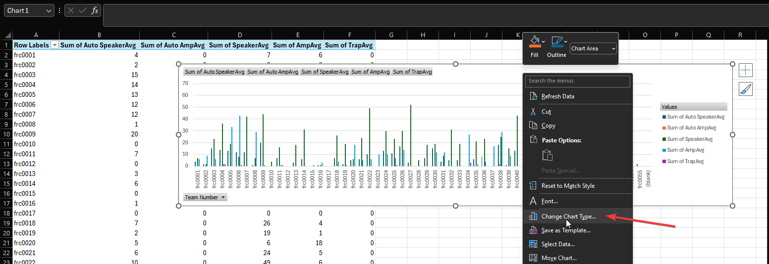
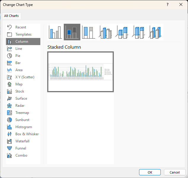
Now choose the chart style you want to try (Stacked Column Chart is selected here).
Here's the end result. Don't forget you can limit how many teams are shown using the
Team Numbermenu at the bottom left of the chart itself. And don't forget to save this file as something other than a .csv file, or you'll lose your work on the chart, filtering, and other worksheet.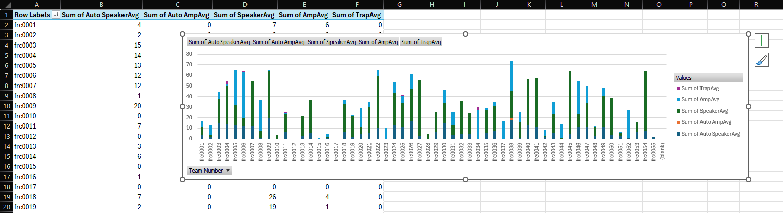
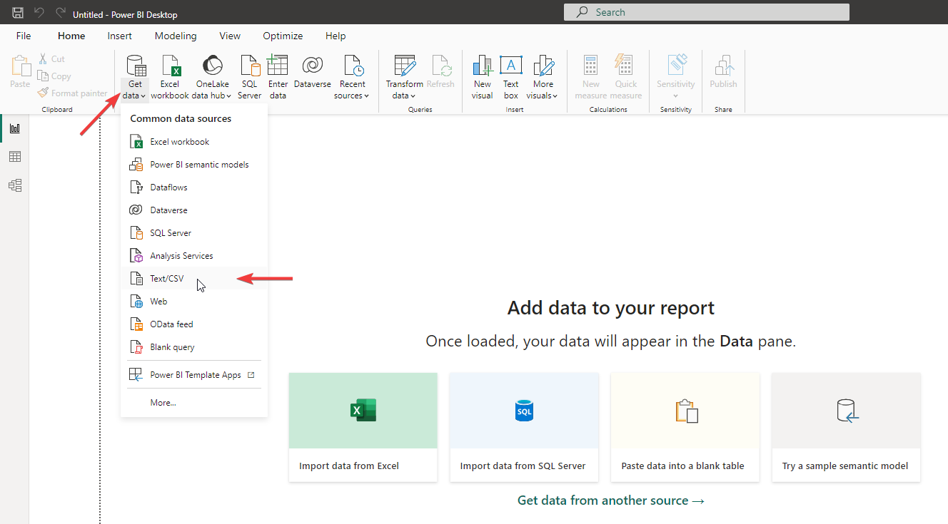
Option 2: Business Analytics (BI) software
Business Analytics software is designed to take a large amount of data, and provide you interactive visuals and filters that can help you find insights in the data that might not be immediately obvious otherwise.
The examples I'll give in this post will use PowerBI Desktop, because it's free for anyone to use with local data like you'll be using.
The first thing you'll need to do once you have a new file open, is to click "Import Data". This is important to know; the actual data will still be in the .csv file on your desktop or wherever you saved it. But from time to time if that file gets updates, you can tell PowerBi to update itself with the new data. So you can build your dashboard and just feed it new data whenever you have it, without losing what you've built.
Once you import your data, there are a few things you'll probably want to do first. So when it shows you a preview of your data, you should see a "Transform" button you can click.
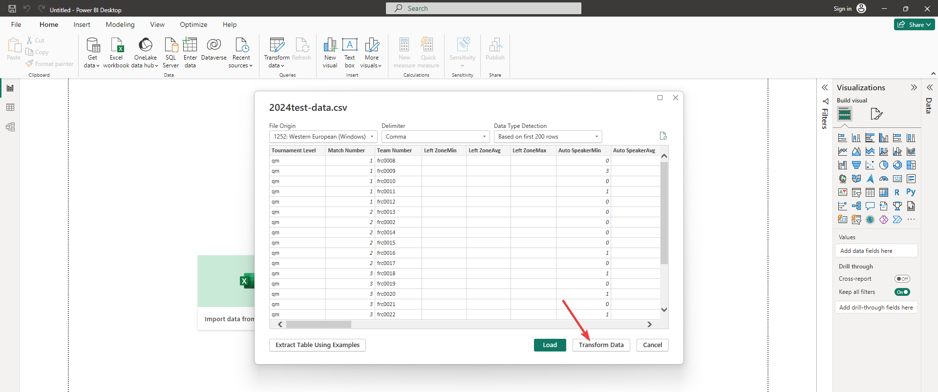
One of the things you'll notice is that the last column has a lot of data in it, that the scouters didn't put in. This column contains the Blue Alliance copy of the official match results, compiled from FIRST™. This will give you the alliance's actual score and other useful information. But it's all crammed into a single column right now- you probably want to have PowerBI expand the data points into their own columns so you can use them more easily.
To do this, scroll all the way over to the right and click the header of the
allianceResultscolumn. Then on theAdd columntab, clickParseand chooseJSON.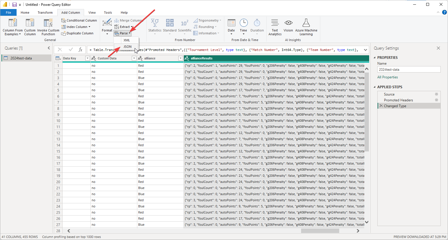
It's still in a single column though- there's one more step to get these all separated. Find your new column and on the right side of its header is an "Expand" button. Click that and decide if you want to use the original column name as a prefix. This will help keep the alliance data all together in your list, but if you want the column names to be a little shorter, you can un-check "Use original column name as prefix". Either way, you can now click
Ok.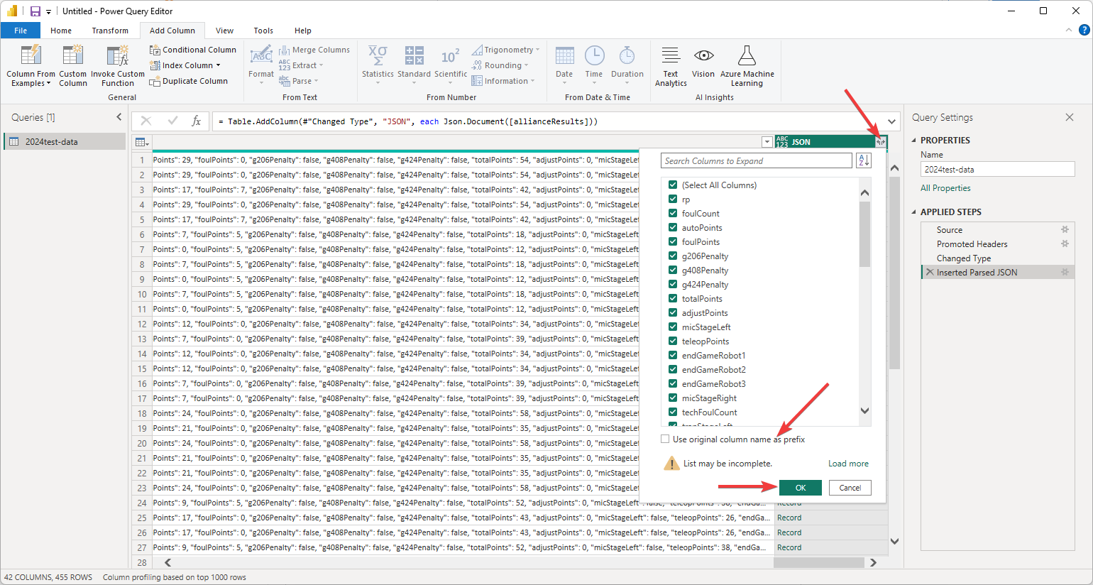
Now on the
Hometab, you can go ahead and finish loading the data into your dashboardWhat you're looking at now is a pretty much blank canvas - you get to design what visualizations you want to add. All your data is in the
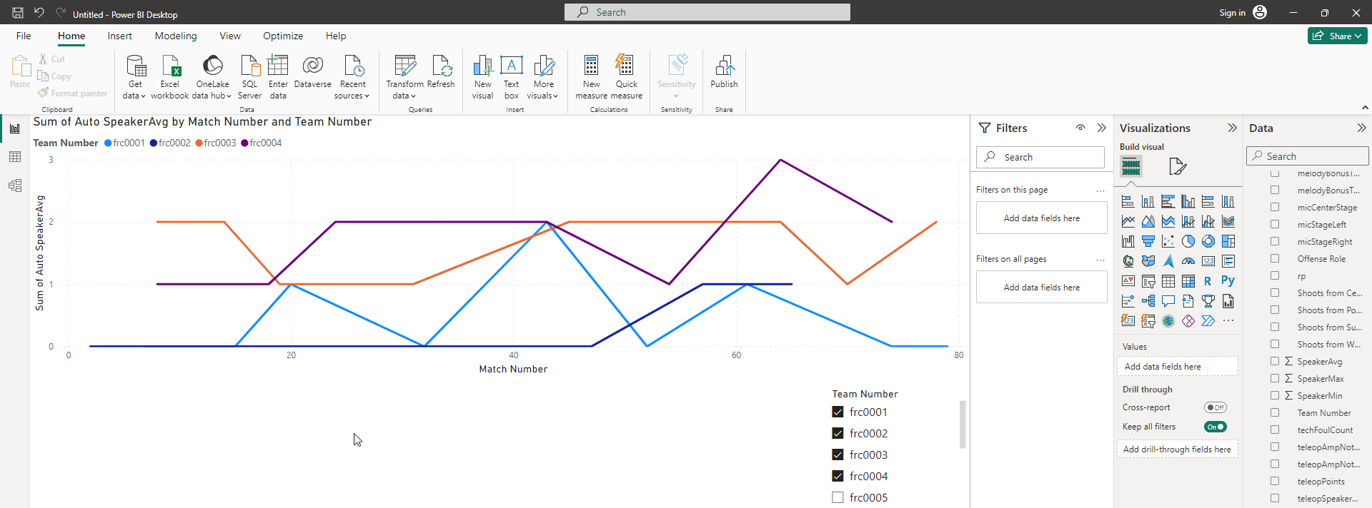
Datapanel on the far right side of the window.Let's start by adding a line graph. On the
Visualizationspanel, click the line chart visualization to add it as a placeholder on the canvas.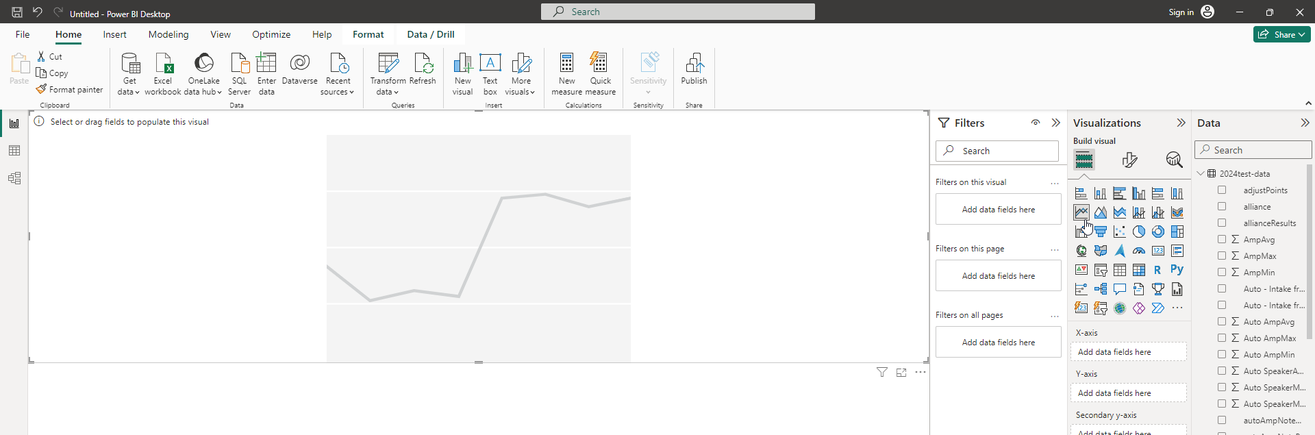
Now we need to tell the chart what data to use. Make sure you've selected the chart in your canvas on the left. Then on the Visualizations panel, you can see that it needs to know what to use as the X axis, the Y axis, and so on. Find the data from the right panel and click-and-drag them into the corresponding boxes in "Visualizations".
- Use
Match Numberas the X axis. - Use
Auto Speaker(or any other data point you want to see) for the Y axis. - Finally, use
Team Numberas the Legend (which tells the graph to have a separate series (line) for each team.
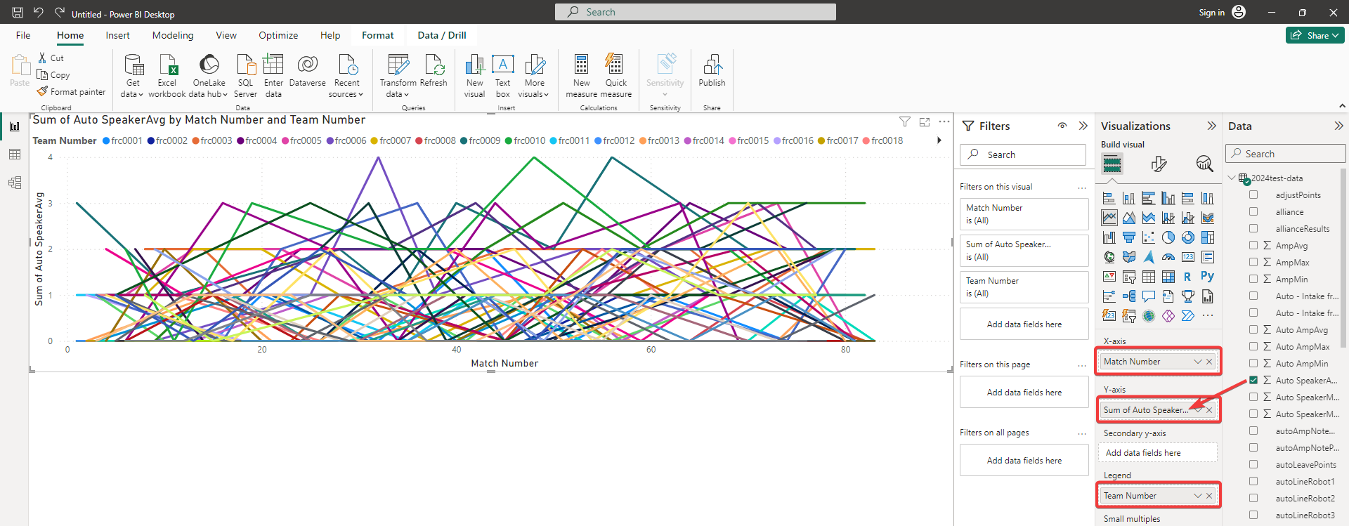
- Use
Great! We've got a visualization. But... there's a LOT of data there- it's hard to make out what's going on.
First of all, know that you can click on the team names in the key at the top of the chart; this will isolate just that team's line. But what you really want to do is compare a few teams side-by-side.
The best way to add filters to your canvas is using what's called a
Slicer. Make sure you don't have any other visualization selected in your canvas, then click on the Slicer Visualization to add it to your canvas.Then, drag
Team Numberinto the slicer'sFieldcontrol.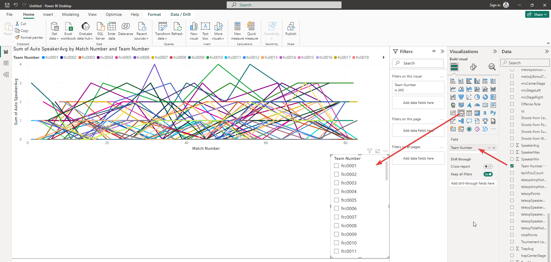
Now you can click on one or more teams in your slicer and the chart will be filtered accordingly, automatically. (Note: you may need to hold Ctrl to select multiple items, until you configure the control to not require that).
But the great thing about BI software is that you're not limited to just a single visualization - and by default all of your visualizations are connected.
So to check out this capability, let's add a pie chart.
Make sure nothing is selected in your canvas, then click the Pie Chart visualization button. Then as before we just need to give it data - as an example let's use
Disabled.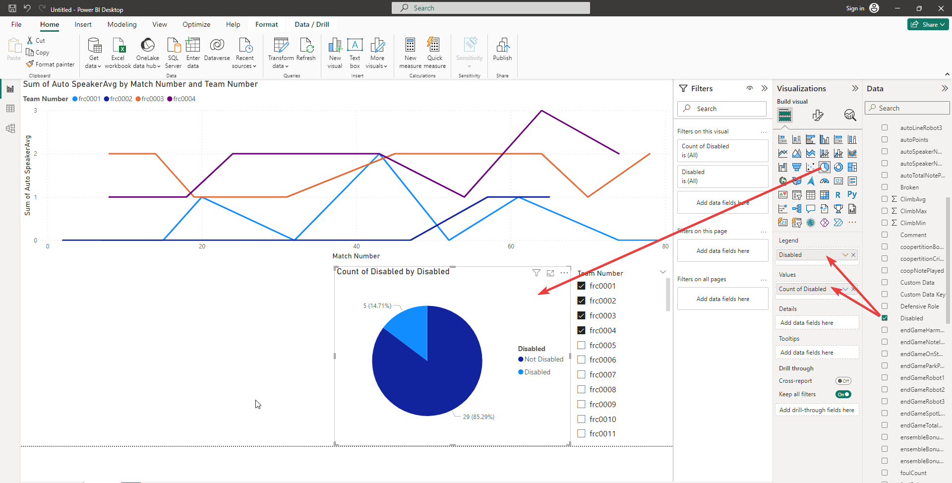
By default it will show you how many matches represented by the filtered teams were marked as "Disabled". But every chart is interactive; click on one slice or another on your pie chart, and the line chart will be filtered to show only matches that match the value you selected.

Let's look at more than one data point at once.
Great! You've built a few visualizations and seen how they can interact. But right now our line chart is only showing a single data point. That's because line charts can only have one piece of data for the primary Y axis. You can use bar charts or stacked bar charts to look at multiple values at once.
But you can also create your own custom columns, calculated from the data. In this case, let's create a column that adds both of the Autonomous score averages.
Right-click on your data file name in the
Datapanel, and choose "New Column". Your cursor will jump up to the formula bar. Name the column whatever you wish (in this example we called itAutoCombined. Then after the equals sign you can start typing to choose existing data columns and add them together with+.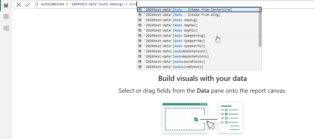
Now that you have a new column, you can replace that into your line chart, and the numbers shown for each team will represent the total of all the pieces they scored in autonomous.
You can go on to create another custom column adding together all the pieces scored in teleop as well. (We'll use both of these custom columns in our last section below).
Finally, let's try one more visualization to keep your creativity flowing
In this example, we added a new tab at the bottom of the window. But you could add this new visualization to the same tab if you'd like, and any filters you select would apply to both.
What we're going to add is a Scatter Chart. This lets us specify an X-axis, a Y-axis, and specify the color and size of dots based on other pieces of data, in addition to putting the team numbers into the legend.
So one more time, make sure nothing is currently selected, then click on "Scatter Chart" in the Visualizations panel.
Add two numeric data fields - one for the x axis (we used our custom TeleopCombined column) and one for the y axis (we used our custom AutoCombined column). For the legend, drag Team Number over to separate each team's dots.
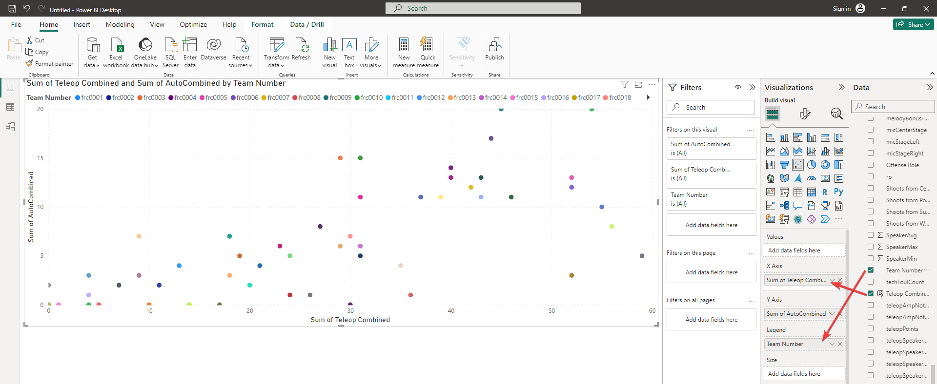
Now each team is an individual dot. The higher the team's dot is, the more pieces they scored in the Autonomous phase. And the further right they are, the more pieces they scored in Teleop. We didn't do it here, but you could add a third numeric value to the Size box to have dots appear larger or smaller depending on how well they did in another metric.
Happy Scouting!